
Smart Business Analytics – KPI Tile, Drilldown: SAP Smart Business is a framework for exposing strategic (key) and operational performance indicators (KPIs, OPIs) as Fiori applications without the need to write any code.
Now it is possible to bring together Analytic Content from multiple Business System be it On-Premise or On-Demand into one single Launchpad irrespective of whatever technology you have implemented.
There are two section in smart business.
- Designtime (Modeler)
- Runtime(KPI Tile and Drilldown)
Using Designtime modeler application, you can configure the smart business runtime.
To understand the complete flow of design time application please follow below link:
https://blogs.sap.com/2016/06/27/create-your-first-smart-business-kpi-and-tiles-in-10-minutes/
Now you already know how to create tile through modeler application. I believe you might have created a tile too.
Now to see this tile at Runtime you need Runtime role as you got it for Designtime application.
Please follow below link to assign your user Runtime role:
SAP Smart Business Service Roles
KPI Tile :
SAP Smart Business KPI tile are Fiori Tile representing Smart Business Analytical App, which shows key performance indicator of business in different visualizations like Numeric, Comparison, Trend, Actual vs. Target, Comparison Tile Multiple Measures, Dual Tile, Harvey Ball and Radial and these option may grow in future.
While you were configuring KPI Tile using modeler application, you could configure different types of tile as suitable to your business. I will explain all tiles in detail now.
(Tile option available)
(Modeler application to configure KPI tile)
In above snapshot you can see Title(KPI), given name for this field will be name of Tile at runtime.
All other required field will appear as per selection of tile format. As shown in above for two different tile format.
Numeric Tile: Data is presented in a number format. The aggregate value of the KPI main measure (like net sales etc.) is displayed on the tile. The color of the value indicates whether the value is in conformance with the threshold values defined or not.
Comparison Tile: You select a dimension (like country, date etc.) for which to show the top KPI values in comparison to each other.
Trend Tile : Here you select a date time dimension and you can see the trend of your business with respect to selected dimension.
Actual vs. Target Tile: Data is presented graphically in the form of a bullet chart that shows the current value of the KPI in relation to the target value and its thresholds.

Comparison Tile Multiple Measures Tile : You select multiple measures to be displayed on the tile. You must select at least two measures. Only a maximum of three measures are allowed. You must select at least two measures or a maximum of three measures. The measures should be either the evaluation main measure or threshold measures or one of the additional measures defined for the evaluation using the Create Evaluation modeler app. You can associate semantic coloring with each of the measures that you choose.

Dual Tile: You can create a dual tile, which is a 2×1 tile. In the dual tile, the left part always shows the KPI measure in numeric format but the right part can show any one of the other tile supported by Smart Business.
Harvey Ball Tile: Data is represented as a Ring chart with highlighted sectors, which show the current value of the KPI in relation to the target value.
Radial Tile: Displays a Pie chart highlighting the status. The status is displayed with a semantically colored radial bar and a percentage value which is the current value of the KPI in relation to the target value.
Therefore, on KPI Tiles in runtime you saw the key indicator of business in various visualization; now let us go to drilldown to analyze the business in detail.
Drilldown:
SAP Smart Business drilldown is an analytical app. It enables the user to view and analyze the data of one key performance indicator (KPI).
Key Feature: In smart business you drilldown further with different slicing feature. You can apply filter and you can move from one Drilldown view to other associated Drilldown view with current context.
You can see there are two main area of drilldown – Header and chart.
The chart area has the biggest real estate. The chart toolbar provides a number of standard interactions. You can switch between different views, chart types, and a table view. The chart can also be enlarged to full screen size.
When you configure the drill-down application using modeler app, the following additional chart types are available to be viewed at runtime drilldown as shown below:
- Column
- Bar
- Line
- Scattered plot
- Table
- Time series line
- Geo map
- Heat map
- Vertical bullet
Modeler application (configured KPI Drill-Down)
Once KPI is configured and tiles are published using modeler application, we can see the tile on Runtime. On click of Runtime tile, we see the Runtime Drilldown as below:
Runtime Drilldown:
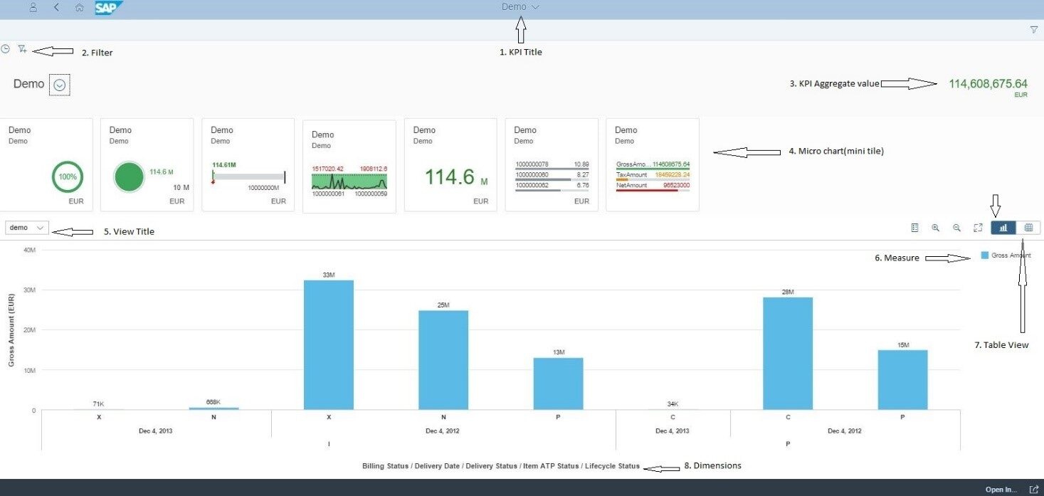
- KPI Title: As shown in snapshot (Demo), KPI title is displayed application title.
- Filter: The facet filter allows the SAP Smart Business user to filter the information shown on the screen at Runtime. The user can filter based on any of the dimensions present in data model in the backend. A change in filter values triggers a refresh of the KPI aggregate value, the mini charts, and the view currently being displayed. The data is displayed with the filter values applied.
- KPI Aggregate Value : At runtime, KPI aggregate value shown in the drill-down header section will be colored in case measure-based threshold values are defined for the evaluation. The color indicates how the KPI aggregate value is performing with respect to the defined thresholds.
- Mini Tile: The header area displays the name of the evaluation, the actual KPI, and tiles with micro charts. A tile can display an additional visualization of the overall KPI. By clicking or tapping these tiles, the user can view further details in a popover. As shown below:
If Mini Tile is coming from an associated KPI Tile, you can navigate from Micro Tile to associated KPI-Drilldown.
- View Title:A KPI can have multiple view configured with different measure, dimension and chart type. The View Title can be configured in different language using modeler application.
- Measure legend: At runtime, the legend is not displayed for a chart view. However, the user can enable the legend using the legend icon on the chart toolbar. If only the evaluation’s main measure is displayed in the view, the name of the measure is not shown in the axis.
- Table View: The chart tool view provides a number of standard interactions. You can switch between different views, chart types, and a table view.
- Dimensions: Selected dimensions are displayed on horizontal-axis of chart.
For more information please follow Smart Business Blog : https://blogs.sap.com/2016/10/25/sap-smart-business-service/
Note: In case you face any issue with Smart Business Service, you can create an Incident on SAP Support Portal with the components: CA-GTF-SB-HCP. You may also contact Smart Business team at [email protected]
New NetWeaver Information at SAP.com
Very Helpfull