
Hi Readers,
I am a Techno-Functional consultant working for SAP Global Trade Management (GTM) product. We thought of introducing analytics in our product and, this blog is about the first development that we have done in the analytics area.
So, lets start with the introduction to GTM, followed by existing report and then the problem statement and the solution provided.
Global Trade Management (GTM) is a product used by trading companies to manage their trades. Trading companies live on low profit margin and deal in large volumes. Traders have a profit margin of around 2-3% and more than 1000’s of trading contracts are created daily to cater their trading business.
To optimize this low margin, traders need to analyze their past data, and understand their business trend. Currently, GTM provides an ALV based Long short report, which is used by traders daily. Long Short report shows all the documents along with their Document No., Quantity, Price etc. which are grouped on yearly or monthly basis. Also, report can be viewed for Purchase Side, Sales side or Both side documents.
Basically, Long Short Report shows open material quantities on both the purchasing and the sales side. The open quantities on both sides are calculated and compared with one another. The difference that results from both open quantities is the long quantity or the short quantity for the material:
- Long quantity: Purchasing-side open quantity is greater than the sales-side open quantity.
- Short quantity: Purchasing-side open quantity is less than the sales-side open quantity.
Existing Report
Long short report can be viewed in transaction WB2L. In WB2L transaction (refer the below screenshot), traders need to enter the selections side and other fields as per their requirement.

After the required fields are entered and executed, long short report (refer the below screenshot) is generated.

Problem Statement:
In the current scenario, an ALV report is generated on executing the Long Short Report transaction. Traders generally use it for viewing the open quantities. This report also has sales and purchase price therefore, it can also be used to analyze these prices.
For analyzing open quantities and, sales and purchase price, plotting graphs seem to be a better option as they make it easier to understand and interpret the data. Graphs can further help traders in analyzing the trends or relationships in data.
Solution Provided:
We came up with the following three scenarios where:
- A bar graph and a pie chart is plotted for material wise open quantity.
- A bar graph is plotted for month wise purchase and sales price across all materials with open quantity.
- Combination of above two.
We have included a Graphical Representation section (highlighted in yellow in below screenshot) in WB2L transaction, where traders can tick checkbox Material wise Open Quantity and/or Sales and Purchase price.

For Material wise Open Quantity, traders need to enter Unit of measure in which they want open quantities to be displayed in graph.
For Sales and Purchase price, traders need to enter the month range or a month for which they need to view the sales and purchase price. Also, traders need to enter currency in which the they want the purchase and sales price to be displayed in the graph.
Note: Other fields in the transaction can be filled as they were filled earlier. Only difference is that if any checkbox in Graphical Representation is ticked then in place of a report, graph will be displayed.
Now let’s have a look at the result of the three scenarios discussed above.
Scenario I: A bar graph and a pie chart is plotted for Material wise Open Quantity.
Traders tick the Material wise Open Quantity checkbox, enter the Unit and, execute the report. A bar graph and a pie chart is displayed.
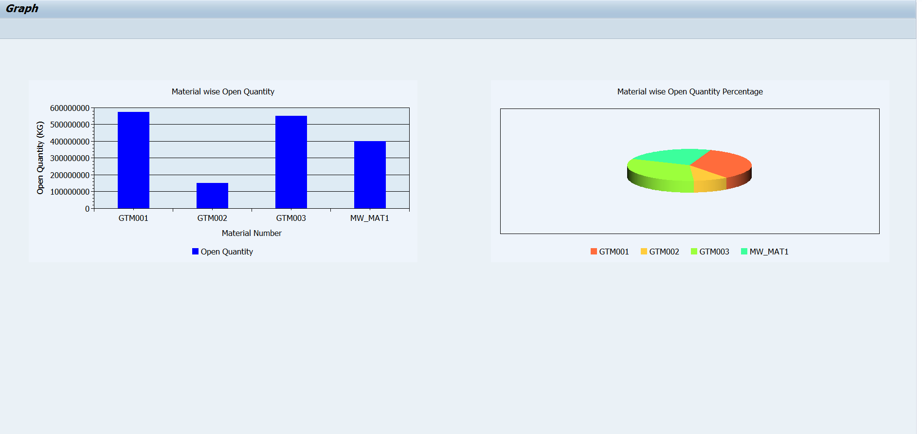
In the above screenshot, bar graph shows Material wise Open Quantity, with Material Number on x-axis and, Open Quantity (in unit of measure entered before, KG in this case) on y-axis. Blue color bar represents the open quantity for a material. Exact Open Quantity figure can be viewed by hovering mouse on the bar of a material.
Pie chart shows Material wise Open Quantity percentage. Percentage figure can be viewed by hovering the mouse on the material color.
Currently, graphs are plotted for at most 12 materials with open quantity. If number of materials are more than 12 then top 12 materials with open quantity will be plotted.
Scenario II: A bar graph is plotted for month wise purchase and sales price across all materials with open quantity.
Trader tick the Sales and Purchase price checkbox, enter the month and currency field and, execute. A bar graph with sales and purchase price across all materials with open quantity is displayed. It has Month in X-axis and Price (in currency as entered in previous screen) in Y-axis. Graph has two bars for each month, bar in blue color is of purchase price and bar in yellow color is of sales price.

Currently, graphs are plotted for at most 12 months. If number of months are more than 12 then, 12 months in ascending order from the starting month (as entered before) will be displayed.
Scenario III: Combination of Scenario I and Scenario II.
In this scenario, traders can view both Material wise Open Quantity and, Sales and Purchase price graphs in a single view. Traders need to tick both the checkboxes i.e. Material wise Open Quantity and, Sales and Purchase price.

Similarly, graphs can be plotted for other scenarios as well using long short report which can be helpful for the traders.
To sum up, in this blog we saw how analytics can be used to enhance the GTM-Long Short report with the help of three different scenarios.
Please provide feedback on the solution provided by us and, also let us know any scenarios which you might be aware of and, which are used by traders in the analysis of long short report.
You can expect future blogs about new developments in GTM Analytics, so stay tuned……
New NetWeaver Information at SAP.com
Very Helpfull